


The linear-gradient() function generates an image with a gradual change in color along a straight path between two or more hues.
It is usually used to style background colors. Styling text color using the linear-gradient function is a very tricky situation. Though it's syntax is very simple when it comes to styling the background on
syntax for linear-gradient
linear-gradient(45deg, blue, red);
the above syntax means the gradient is tilted 45degrees starting with blue color and ends with red color.
There are different syntax on how to implement linear-gradient. We will not go in it in this article.
Below is the steps with pictorial proof on how to use the linear-gradient() function on a text
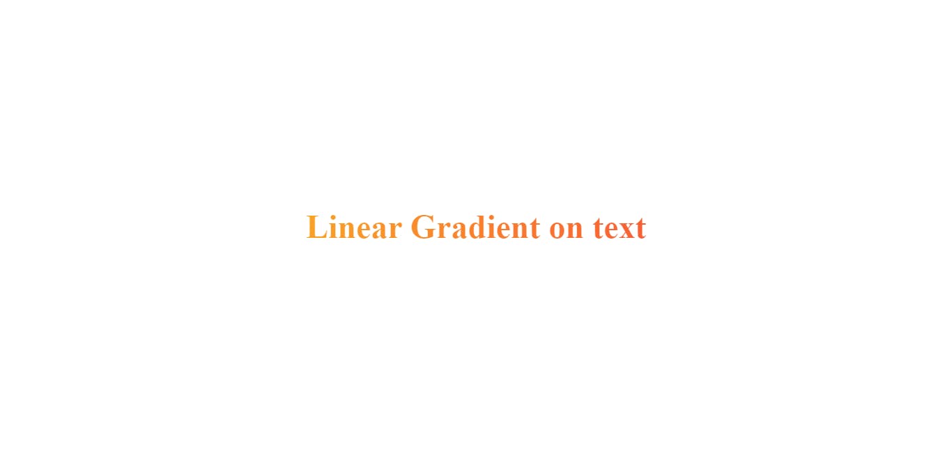
Step 1: You wrap your text in any typography tags (h1 - h6 or p) depending on your preference. In this case I am wrapping my text in a heading 1 tag
<h1>Linear Gradient on text</h1>
Step 2: You target your heading 1 tag and style it.
h1{
            font-size: 3rem;
            background-color: red;

            /* Create the gradient */
            background-image: linear-gradient(98.63deg, #f9a225 0%, #f95f35 100%);;

            /* Set the background size and repeat properties */
            background-size: 100%;
            background-repeat: repeat;

            /* Use the text as a mask for the background */
            /* This will show the gradient as a text color rather than element bg */
            -webkit-background-clip: text;
            -webkit-text-fill-color: transparent;
            -moz-background-clip: text;
            -moz-text-fill-color:transparent;
        }
NB: You can do your basic text styling like changing the font-family, font-size and many more.
OUTPUT
Below is the complete HTML and CSS code for applying linear-gradient() on a text
<!DOCTYPE html>
<html lang="en">
<head>
    <meta charset="UTF-8">
    <meta http-equiv="X-UA-Compatible" content="IE=edge">
    <meta name="viewport" content="width=device-width, initial-scale=1.0">
    <title>Document</title>
    <style>
        *{
            padding: 0;
            margin: 0;
            box-sizing: border-box;
        }
        body{
            display: flex;
            flex-direction: column;
            align-items: center;
            justify-content: center;
            height: 100vh;
        }
        h1{
            font-size: 3rem;
            background-color: red;

            /* Create the gradient */
            background-image: linear-gradient(98.63deg, #f9a225 0%, #f95f35 100%);;

            /* Set the background size and repeat properties */
            background-size: 100%;
            background-repeat: repeat;

            /* Use the text as a mask for the background */
            /* This will show the gradient as a text color rather than element bg */
            -webkit-background-clip: text;
            -webkit-text-fill-color: transparent;
            -moz-background-clip: text;
            -moz-text-fill-color:transparent;
        }
    </style>
</head>
<body>
    <h1>Linear Gradient on text</h1>
</body>
</html>